Low P/E Stocks: Hidden Gems or Clever Traps?

Low P/E Stocks

Valuing Low P/E Stocks: Opportunities vs. Valuation Traps

For anyone walking the value-investing path, few numbers are as tempting as a low P/E ratio. A stock trading at 8x or 10x earnings feels like a clearance sale. The business is earning money, yet the market seems uninterested. Surely this is where fortunes are made?

Sometimes, yes. But just as often, low P/E stocks are cheap for a reason and that reason can quietly destroy capital. Understanding why a P/E is low matters far more than how low it is. Let’s slow down, strip away the noise, and look at low P/E stocks the way a patient investor should.

1. What the P/E Ratio Really Tells You

  • 1.1. Core Definition: At its simplest, the Price-to-Earnings (P/E) ratio tells you how much the market is willing to pay for one rupee of a company’s earnings.

    $$\text{P/E Ratio} = \frac{\text{Market Price}}{\text{Earnings Per Share}}$$
  • 1.2. Baseline Perception: A P/E of 10 means investors are paying ₹10 for every ₹1 the company earns. Traditionally:

    • Low P/E: Cheap, unloved, possibly undervalued

    • High P/E: Expensive, popular, growth expectations baked in

  • 1.3. The Hard Reality: The uncomfortable truth most beginners learn the hard way is that the P/E ratio doesn’t tell you whether earnings will survive. And that’s where things get interesting and dangerous.

2. Why Low P/E Stocks Look So Attractive

Low P/E stocks pull value investors in because they promise asymmetry—limited downside, large upside. The thinking goes like this:

  • 2.1. The business is already profitable.

  • 2.2. Expectations are low.

  • 2.3. Even a small improvement could re-rate the stock.

And sometimes, that thinking is spot on.

3. When Low P/E Stocks Are Genuine Opportunities

3.1. Market Overreaction

  • Markets are emotional creatures. Bad news—such as quarterly misses, regulatory headlines, or macro fears—often pushes prices down faster than fundamentals deteriorate.

  • In such moments, quality businesses can trade at low P/Es temporarily. Investors who bought strong banks or FMCG companies during crisis periods didn’t do anything clever—they simply stayed rational when the market panicked.

3.2. Cyclical Lows (Not Peaks)

  • Cyclical businesses move in waves. Steel, oil, chemicals, and automobiles see profits swing wildly based on economic conditions.

  • A cyclical stock trading at a low P/E during a downturn can be a gift, because earnings are depressed, not inflated. Timing matters here. Buying cyclicals at the bottom of the cycle is value investing. Buying them at the top is how people get trapped.

3.3. Boring but Predictable Businesses

  • Some businesses never make headlines. They don’t promise disruption or exponential growth. Yet they quietly generate cash year after year.

  • Utilities, consumer staples, and mature retail chains often trade at modest P/Es simply because they’re boring. Over time, dividends and steady compounding do the heavy lifting.

4. How Low P/E Ratios Fool Investors

Now for the harder part. Many low P/E stocks aren’t bargains—they’re warnings. Here’s how they fool even experienced investors.

4.1. The Cyclical Peak Illusion

This is one of the most common traps.

  • 4.1.1. A cyclical company reports record profits.

  • 4.1.2. Margins expand dramatically.

  • 4.1.3. EPS shoots up.

  • 4.1.4. P/E collapses.

  • 4.1.5. The stock suddenly looks cheap—but earnings are at their peak, not normal.

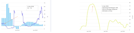
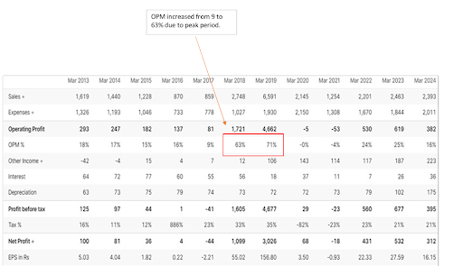
Take cases like graphite electrode manufacturers during supply shortages. Operating margins jumped from single digits to 60–70%. Earnings exploded. P/E ratios collapsed. But when supply normalised, margins vanished. Earnings fell. And the “cheap” stock wasn’t cheap anymore—it was priced for peak profits that never returned. Low P/E caused by peak earnings is not undervaluation. It’s an illusion.

A classic Indian example of this trap is HEG Ltd. In 2017–18, a global shortage of graphite electrodes driven largely by environmental shutdowns in China sent prices soaring. HEG’s operating margins exploded from single digits to over 60%, and profits followed. On the surface, the stock looked absurdly cheap, with the P/E ratio collapsing to seemingly “bargain” levels.

But those earnings were peak-cycle earnings, not normalised ones. As supply returned and prices cooled, margins reverted, profits fell sharply, and the low P/E that once looked attractive revealed itself as an illusion. Investors who bought purely on valuation learned a hard lesson about confusing cyclical peaks with sustainable profitability.

4.2. One-Time Gains Dressing Up Earnings

Sometimes earnings look strong—but only on paper due to:

  • 4.2.1. Asset sales

  • 4.2.2. Tax benefits

  • 4.2.3. Accounting adjustments

These inflate net profit temporarily, dragging the P/E down. If you don’t strip out these one-offs, you’re valuing a business on earnings that won’t repeat. Cash flow usually exposes this lie faster than profit and loss statements.

4.3. Declining Businesses Wearing a Cheap Label

A shrinking business often looks cheap right before it becomes irrelevant.

  • 4.3.1. Revenue stagnates.

  • 4.3.2. Margins erode.

  • 4.3.3. Competition intensifies.

  • 4.3.4. The market senses this before the financials collapse—and prices the stock accordingly.

Cases like Café Coffee Day tell this story well. Once commanding high P/E multiples, the business slowly lost relevance. As profits declined and losses mounted, the P/E compressed—not because value emerged, but because confidence disappeared. A low P/E cannot revive a broken business model.

4.4. Debt Makes Cheap Stocks Dangerous

  • Debt changes everything. A leveraged company might look optically cheap until interest costs eat into earnings or refinancing becomes difficult.

  • During downturns, debt doesn’t just reduce upside—it threatens survival. Many energy and infrastructure stocks learned this lesson brutally during commodity crashes. A low P/E with high debt is not value—it’s leverage disguised as opportunity.
 

High P/E Can Fool You Too

Interestingly, the reverse also happens.

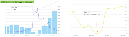
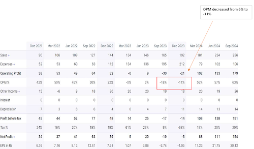
A high P/E doesn’t always mean overvaluation. Cyclical stocks during downturns often show absurd P/E ratios because earnings collapse temporarily. In such cases, high P/E reflects depressed earnings, not expensive prices. This is why relying on P/E alone — low or high  without context leads to bad decisions. In FY23–24, MCX reported sharply lower profitability due to one-time technology transition costs and regulatory uncertainty.

Operating margins turned negative, earnings collapsed, and the P/E ratio shot up to eye-watering levels making the stock look outrageously expensive on the surface.

But the elevated P/E wasn’t a reflection of an overpriced stock; it was the result of temporarily depressed earnings. As operational stability returned and volumes normalised, profitability improved and the valuation started making far more sense in hindsight. A low P/E ratio isn’t an answer it’s a starting point.
Sometimes it reflects fear or temporary disruption, creating real opportunities. Other times, it hides peak-cycle earnings or structural decline, turning “cheap” stocks into value traps. Examples like HEG and MCX show that valuation only makes sense when viewed in context.

Good investing isn’t about buying low P/E stocks or avoiding high ones. It’s about understanding why a stock is priced the way it isand whether its earnings are sustainable. In the end, numbers don’t create value.
Durable businesses do.

DuPont Analysis: Why a High ROE Can Be a Trap (And How Smart Investors See Through It)

DuPont Analysis concept art showing High ROE Trap elements

A high Return on Equity (ROE) is often treated like a badge of honor in investing. A company showing a 20–25% ROE immediately looks attractive. But here’s the uncomfortable truth: ROE alone can lie.

Two companies can report the exact same ROE and yet be worlds apart in quality and risk. One may be a genuinely strong business with pricing power and disciplined operations. The other may simply be using heavy debt to manufacture artificial returns.

So how do you separate real performance from financial engineering? That’s where DuPont Analysis comes in. This nearly century-old framework breaks ROE into its core drivers, allowing investors to understand how returns are generated—and whether those returns are sustainable.

The Problem With Looking at ROE in Isolation

Standard ROE is calculated using a single, high-level formula:

ROE = Net Income ÷ Shareholders’ Equity

Simple. Clean. Dangerous.

Imagine two competing companies:

  • Company A: Earns ₹100 crore on ₹500 crore of equity with little or no debt.

  • Company B: Earns the same ₹100 crore on ₹500 crore of equity—but carries ₹2,000 crore of debt.

Both show a 20% ROE, but only one deserves your capital. Standard ROE doesn’t tell you how profits were achieved. DuPont Analysis does.

What Is DuPont Analysis?

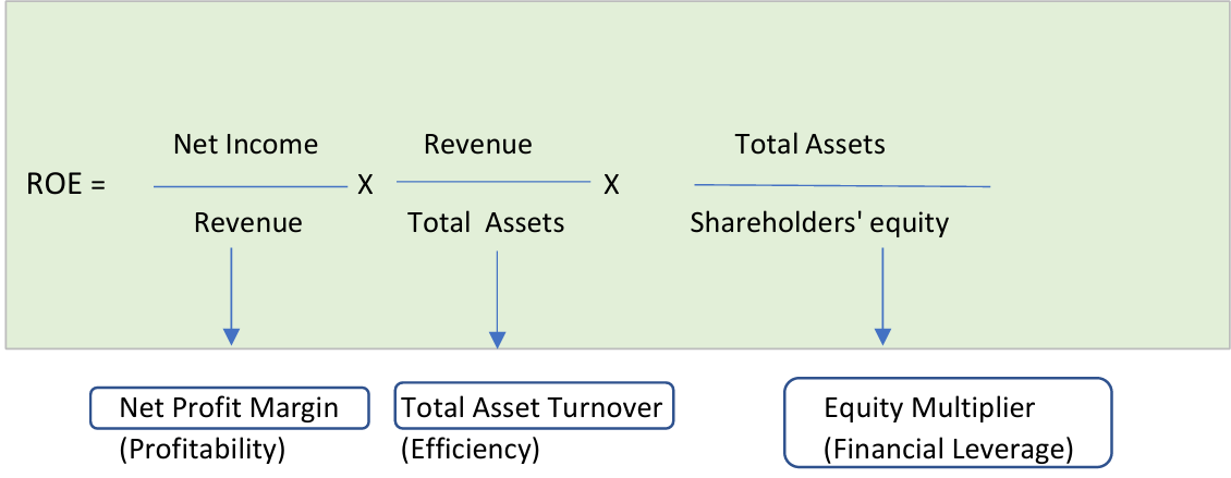
The traditional DuPont Analysis decomposes the basic ROE metric into three distinct operational and financial drivers:

ROE = Profit Margin × Asset Turnover × Financial Leverage

dupoint analysys formula diagram

Each component answers a fundamental question about the business model:

  • Profit Margin: How much profit is made from each rupee of sales? (Operating Efficiency)

  • Asset Turnover: How efficiently are assets used to generate revenue? (Asset Efficiency)

  • Financial Leverage: How much debt is being used to boost returns? (Financial Leverage)

Together, these reveal whether a company’s high returns are coming from core business strength or dangerous balance-sheet risk.

The Three Drivers of ROE (Explained Simply)

  • 1. Profit Margin (The Quality of Earnings)

    Net Profit Margin = Net Income ÷ Revenue

    This shows how much of each rupee earned actually turns into bottom-line profit. High margins usually signal strong pricing power, cost discipline, or a competitive moat (like FMCG leaders or IT services firms). If margins are razor-thin, the business has very little room for error.

  • 2. Asset Turnover (How Hard the Business Works Its Assets)

    Asset Turnover = Revenue ÷ Total Assets

    This measures asset speed and utilisation. Some businesses operate on thin margins but compensate by selling massive volumes quickly (e.g., retail chains like DMart). Capital-heavy businesses such as infrastructure naturally score lower, which is an industry reality rather than a operational flaw.

  • 3. Financial Leverage (The Risk Multiplier)

    Equity Multiplier = Total Assets ÷ Shareholders’ Equity

    This shows how much debt is being deployed to magnify returns. Leverage amplifies ROE—but it also magnifies losses. An equity multiplier of $1.0$ means zero debt. A ratio of $5.0$ means 80% of the company’s assets are funded by borrowing. While high leverage isn’t inherently evil, it always demands extreme caution.

3-Step DuPont Case Study: Britannia Industries Ltd. (FY2025)

Using this framework, we can dissect Britannia’s financial performance to see exactly what drives its premium returns:

5-Step DuPont Analysis: Britannia Industries Ltd. (FY2025)

DuPont ComponentMetric ValueOperational Takeaway
1. Net Profit Margin12.14%Britannia earns ~₹12.14 in profit for every ₹100 of revenue, showcasing healthy pricing power and brand strength in a competitive FMCG environment.
2. Asset Turnover2.0xGenerates ₹2 of revenue for every ₹1 invested in assets. This indicates an asset-light, highly efficient distribution and inventory model.
3. Equity Multiplier2.16xReflects balanced, controlled financial leverage. Assets are funded by a healthy mix of equity and debt without introducing structural balance sheet risk.

Investor Assessment: This is a high-quality ROE profile. The returns are driven by real operating margins and rapid asset recycling, not manufactured via accounting leverage.

The 5-Step DuPont Analysis: A Deeper Look

While the traditional 3-step model is great, the 5-step DuPont model goes one layer deeper. It actively separates the direct impact of taxes and interest costs, letting you isolate core operational strength from tax breaks or debt structures.

  • 1. Tax Burden Component

    Formula: Net Income ÷ EBT
    What it shows: How much profit remains after tax.

    A higher ratio indicates tax efficiency or a stable tax regime. A lower ratio may reflect higher effective tax rates or loss of tax benefits.

  • 2. Interest Burden Component

    Formula: EBT ÷ EBIT
    What it shows: Impact of interest costs on profitability.

    A ratio close to 1 means low interest pressure. A falling ratio indicates that debt servicing is eating into operating profits.

    3. Operating Profit Margin

  • Formula: EBIT ÷ Revenue
    What it shows: Core operating strength before financing and taxes.

    This is the purest measure of business quality—pricing power, cost control, and operating leverage.

  • 4. Asset Turnover

    Formula: Revenue ÷ Total Assets
    What it shows: How efficiently assets are used to generate sales.

    High turnover businesses rely on volume and speed, not heavy margins.

  • 5. Equity Multiplier

    Formula: Total Assets ÷ Shareholders’ Equity
    What it shows: Degree of financial leverage.

    Higher leverage boosts ROE—but also increases financial risk.

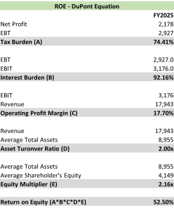
5-Step Model Interpretation: Britannia Industries Ltd. (FY2025)

DuPont Analysis: Britannia Industries Ltd. (FY2025)

When applying the deep 5-step model to Britannia, the underlying operational reality becomes completely transparent:

  • Core Operating Strength Rules: An 18% EBIT Margin combined with a 2.0x Asset Turnover proves that Britannia’s structural returns are generated by excellent business fundamentals.

  • Minimal Interest Strain: An Interest Burden of 92% indicates that the vast majority of operating profit flows cleanly through to pre-tax income. Debt is present, but it does not distort performance metrics.

  • Stable Tax Structure: A Tax Burden of 74.4% shows that the company isn’t relying on aggressive tax holidays or temporary loop-holes to artificially inflate its numbers.

  • Supporting Leverage: With an Equity Multiplier of 2.16x, leverage acts purely as a calculated booster rather than a primary manufacturing engine for their ROE.

Summary: 3-Step vs. 5-Step DuPont

  • 3-Step DuPont tells you where your ROE comes from.

  • 5-Step DuPont tells you why it comes from there.

ROE is a remarkably powerful metric, but only if you choose to dissect what sits underneath it. Britannia’s clean metrics highlight exactly what high-quality earnings look like.

The ultimate takeaway for long-term investors is simple: Don’t just look at the headline ROE figure—dissect it. Long-term wealth is built by completely understanding how returns are earned, rather than chasing a single impressive number.

How to Analyse Bank Stocks Like a Pro: A Complete Beginner’s Guide

how to analyze bank like a pro

Banking Industry Factors & Financial Ratios

Before diving into financial ratios, it’s important to understand the broader factors that influence the banking industry. Four key variables, controlled by the RBI, play a major role in determining liquidity, lending, and overall economic activity.

1. Macro Environment Factors

  • 1.1. Cash Reserve Ratio (CRR): Refers to the portion of deposits banks must keep with the RBI. When CRR increases, banks have less money available to lend, reducing liquidity in the system.

  • 1.2. Statutory Liquidity Ratio (SLR): Requires banks to hold a certain percentage of deposits in liquid assets such as government securities, gold, or cash. A higher SLR further restricts lending capacity.

  • 1.3. Repo Rate: The rate at which banks borrow from the RBI. When it rises, borrowing becomes expensive, leading to reduced lending and slower economic activity.

  • 1.4. Reverse Repo Rate: The rate at which the RBI borrows from banks. When this increases, banks prefer parking money with the RBI instead of lending, again reducing liquidity.

Together, these four factors give a clear picture of the banking environment—whether liquidity is tight or abundant, and whether lending growth is likely to accelerate or slow down.

2. Key Parameters to Analyse in a Bank

Once you understand the macro environment, the next step is analysing a bank’s financials. Instead of getting overwhelmed, focus on a few key metrics that truly matter.

2.1. Interest Income: The Core Engine

  • Interest income is the primary source of revenue for any bank. It represents the money earned by lending funds to customers—whether through home loans, personal loans, or business loans.

  • A consistent rise in interest income usually indicates that the bank is expanding its loan book and generating higher earnings. For example, HDFC Bank reported a 19% year-on-year growth in interest income, reflecting strong lending activity.

  • For any investor, this is one of the first numbers to check in the Profit & Loss statement.

2.2. Net Interest Income (NII): The Real Earnings Power

  • Net Interest Income (NII) is the difference between interest earned and interest paid.

  • In simple terms, it shows how much a bank actually earns after paying depositors.

  • A rising NII indicates improving profitability, while a declining NII suggests pressure on margins. HDFC Bank, for instance, reported an 18% growth in NII—signaling strong improvement in its core business.

2.3. Net Interest Margin (NIM): Profitability Efficiency

  • NIM measures how efficiently a bank earns from its lending operations relative to its loan book.

  • A higher NIM means better profitability, while a declining NIM can signal margin pressure—even if loan growth remains strong.

  • For example, a slight drop in HDFC Bank’s NIM from 3.5% to 3.4% suggests moderation in lending profitability. While small, such trends are worth tracking over time.

2.4. Cost of Funds (CoF): The Hidden Driver of Margins

  • Cost of Funds represents the average rate at which a bank raises money.

  • Lower cost of funds is always better because it directly improves margins. A bank that can raise money cheaply—due to strong trust or brand—has a significant competitive advantage.

  • HDFC Bank’s declining cost of funds from 4.9% to 4.5% is a positive sign, indicating efficient funding management.

2.5. CASA Ratio: Cheap Money Advantage

  • CASA (Current Account Savings Account) ratio shows the proportion of low-cost deposits in total deposits.

  • Since current accounts pay zero interest and savings accounts pay very low interest, a higher CASA ratio reduces the cost of funds and boosts profitability.

  • However, CASA should always be analysed alongside NIM and CoF to ensure it is actually improving margins.

2.6. NPAs: The Reality Check

  • Non-Performing Assets (NPAs) represent loans where borrowers have defaulted.

  • Low NPAs indicate strong asset quality, while high NPAs signal risk and potential losses.

  • There are two key types:

    • Gross NPA (GNPA): Total bad loans

    • Net NPA (NNPA): Bad loans after provisions

  • HDFC Bank’s GNPA declining from 1.4% to 1.2% reflects strong credit discipline and recovery mechanisms.

2.7. Provision Coverage Ratio (PCR): The Safety Cushion

  • PCR measures how much of bad loans are already covered through provisions.

  • A higher PCR means the bank is well-prepared to absorb losses. Typically, a PCR between 65%–80% is considered healthy.

  • Think of PCR as a shock absorber—it protects the bank during stress periods.

2.8. Advances Growth: Business Expansion

  • Advances refer to loans given by the bank.

  • Strong growth in advances indicates business expansion and higher future earnings potential. However, this growth should always be compared with peers and checked for sustainability.

2.9. Capital Adequacy Ratio (CAR): Financial Strength

  • CAR measures how much capital a bank has relative to its risk-weighted assets.

  • It acts as a safety buffer during economic stress. In India, banks are required to maintain at least 9%, but strong banks often maintain much higher levels.

  • HDFC Bank’s CAR of 21.8% reflects a very strong capital position.

2.10. Credit to Deposit Ratio (CD Ratio): Lending Efficiency

  • The CD ratio shows how much of deposits are converted into loans.

  • A very high ratio (above 100%) can indicate aggressive lending and potential liquidity risk, while a very low ratio may indicate underutilisation of funds.

  • Balance is key.

2.11. Cost to Income Ratio: Operational Efficiency

  • This ratio tells us how much a bank spends to earn every ₹100 of income.

  • Lower is better. It indicates strong cost control and operational efficiency.

3. Final Thoughts

  • Analysing banks is not about looking at one or two numbers—it’s about understanding the complete picture.

  • Interest income, NII, and NIM tell you about earnings power.

  • CASA and cost of funds reveal efficiency in raising capital.

  • NPAs and PCR highlight risk management.

  • CAR and CD ratio show financial strength and liquidity.

  • When analysed together over multiple years, these metrics give a clear picture of a bank’s health.

  • The goal isn’t perfection—it’s understanding trends.

  • Because in banking, consistency matters far more than one good year.